Dollar Bill Redesign
Introduction
I re-designed two U.S. currency notes (front and back, 4 total layouts). I had to use a subject/theme that’s different from the current focus on past presidents. My target audience is the entire country so my design should be nationally recognizable. I settled on the prominent, well–recognized figures in America’s technological advances. For the color scheme I borrowed the iconic red, white, and blue palette.
Objectives
• Research the history of the design and development of the US currency.
• Research other countries currencies design.
• Identify significant but perhaps not mainstream symbols of the history of the US to develop an alternative themed identity solution for the existing designs.
• Develop consistency across multiple pieces of visual collateral.
•Apply the principles and elements of design.
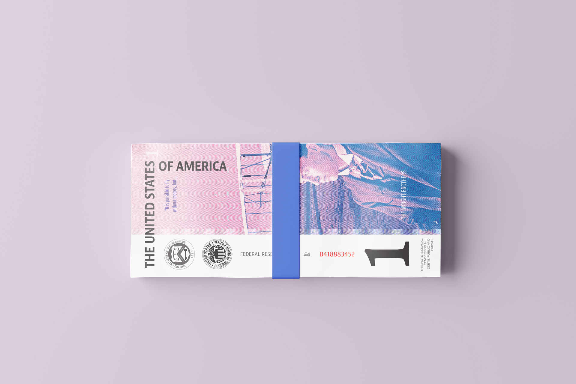
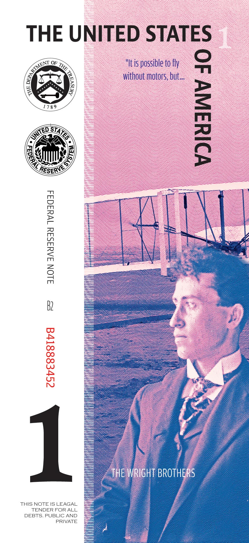
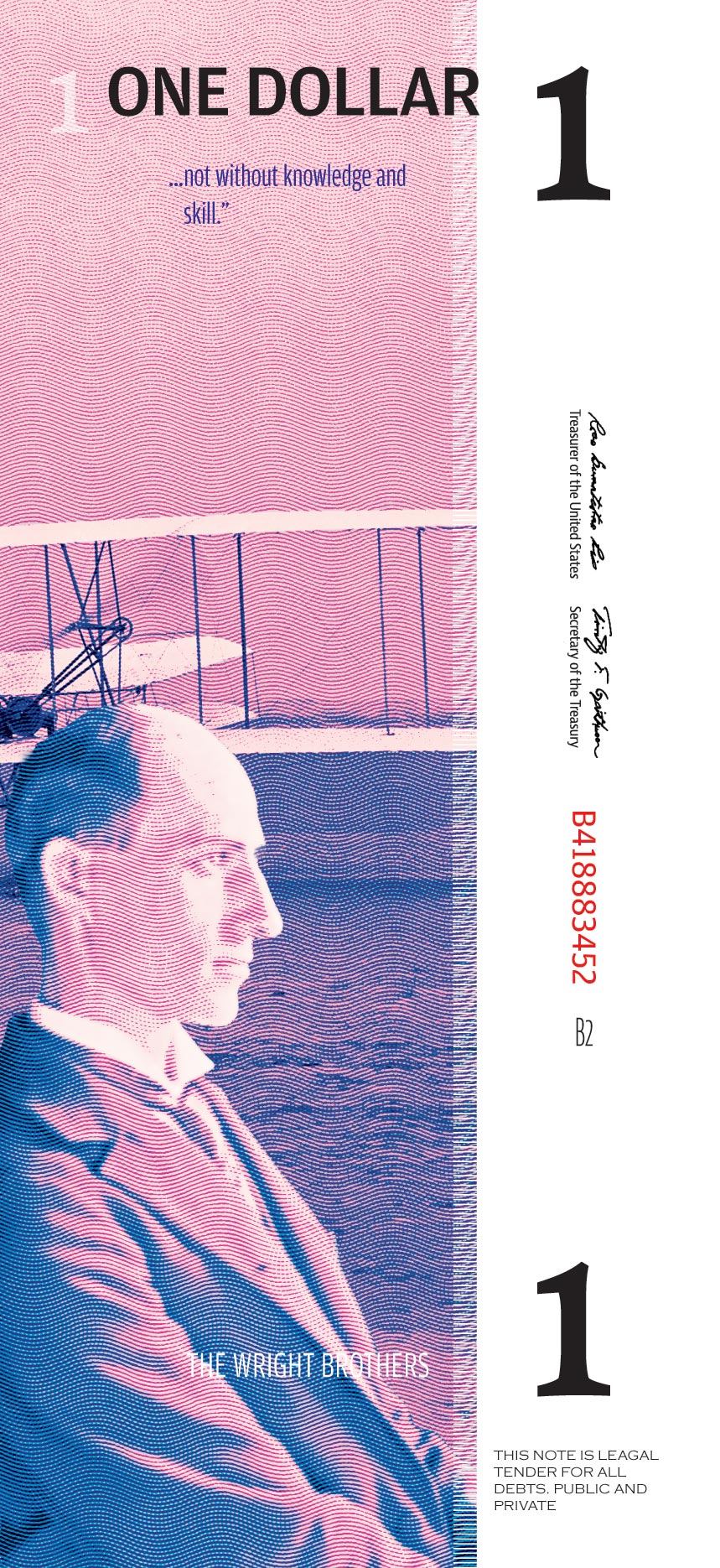
$1 Bill
For one of the two bills I chose to have the Wright Brothers (Orville Wright and Wilbur Wright) on both sides of the bill. The idea was to have them back to back when you place the bills next to one another. On both sides there is a quote from Wilbur Wright that says “It is possible to fly without motos, but not without knowledge and skill.” The quote reflects their philosophy on flight, and reflects their understanding of principles of aerodynamics and piloting techniques.

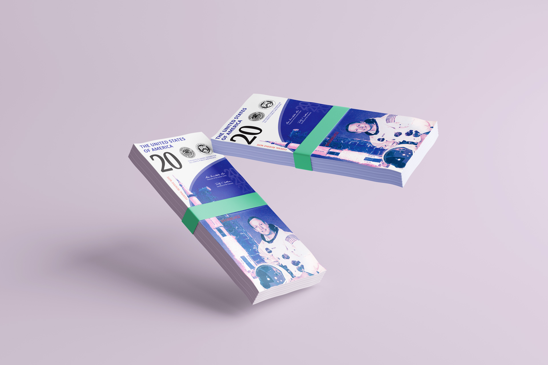
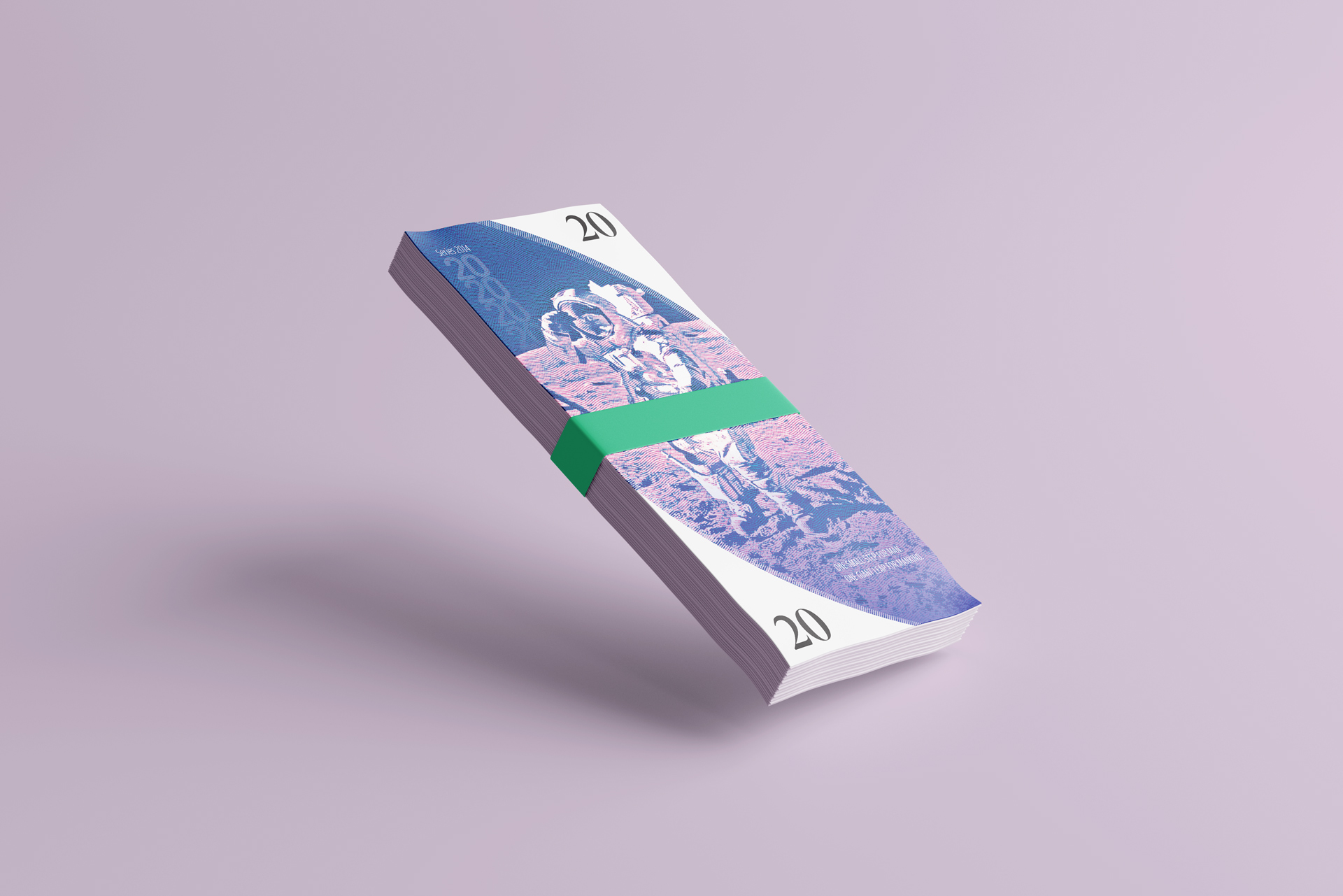
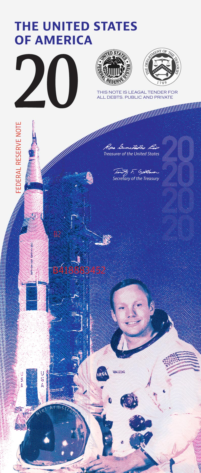
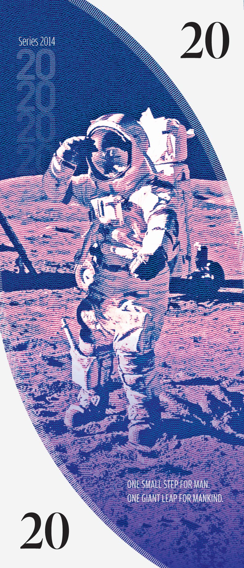
$20 Bill
From what i’ve experienced, $20 bills are the most commonly used, so I put Neil Armstrong (one of the first astronauts to walk on the moon.) The moon landing is still one of the most discussed moments in U.S. history. Many still debating if it was even real. Similarly to the $1 bill, I put the quote “One small step for man; One giant leap for mankind.” While the landing itself was impressive, it opened up new opportunities in technological advancements and exploration of space.
Artist Reflection
“At the start of the project, I was intimidated. Since it was the start of a new semester, I was hoping for an easier or simpler project, but alas it was not. When we started sketching, it would get progressively harder to keep putting out ideas, so I mainly focused on layouts and shapes rather than where everything would go. At the start of the project, my concept was America’s technological advancements over the centuries. So, the $1 would be sailboats, $5 would be trains, $10 cars, $20 planes, $100 would be spacecraft. However, halfway through I realized it wasn’t American enough. Many countries have gone through similar advancements, so I focused on the American people. I chose Neil Armstrong and the Wright brothers. To me, these are recognizable individuals. Also, it was easy to find copyright-free images. It was also fun using these new elements to create a flow in the dollar. I was focused on making the eye follow the composition in a loop. I also chose red and blue duo colors since those were recognizably American. I was worried it came off too much as purple, but after critique you praised it, so I felt better. Honestly, the two designs were supposed to be two different versions, but they looked similar enough to be a family. So, I kept it like that. Overall, I really enjoyed the result and might even use it for sophomore review!”