Aerisform Mattress Co. Branding
Introduction
Aerisform was founded with one simple mission: to create a mattress that offers cool, restful sleep. After years of experiencing sleepless nights due to overheating, our founder, Genevieve Clarissa Montgomery-Sinclair, decided to solve the problem herself. Partnering with sleep scientists and material experts, she developed advanced cooling technology and combined it with high-quality, eco-conscious materials. This guide book is to be used as reference for any brand related external or internal projects. Contact our design team for any further questions.
Logos
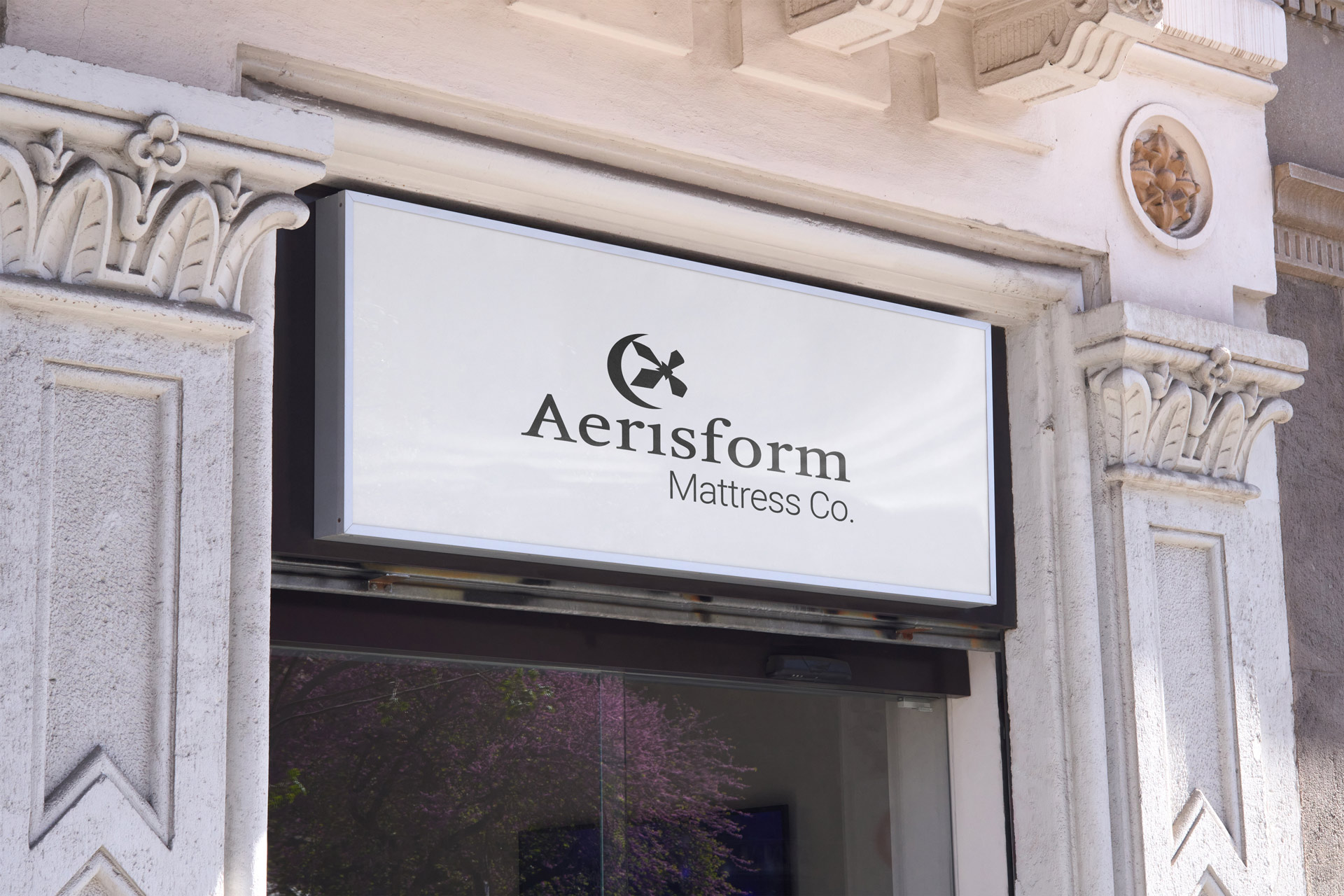
Aerisform’s logo takes out the tiddle of the “i” and replaces it with a glacier bubble, representing the mattress’ cooling ability and comforting embrace. The name, Winter’s Night Sky, was given to the the brands specific blue. It creatively combines the allusions to sleeping at night and the coolness of the cold season.
Color
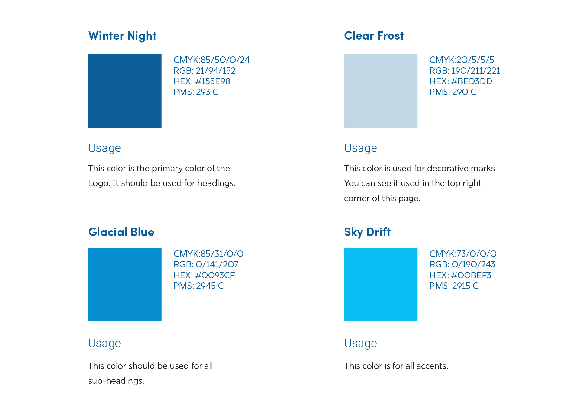
To reflect the cooling nature of Aerisform’s mattresses it’s only natural to go for cool blues. Their names also reflect things associated with winter. Although literal, Winter Night compliments Aerisform’s goals for their customers, creating mattresses that feel like sleeping in the cold winter.
Stationery
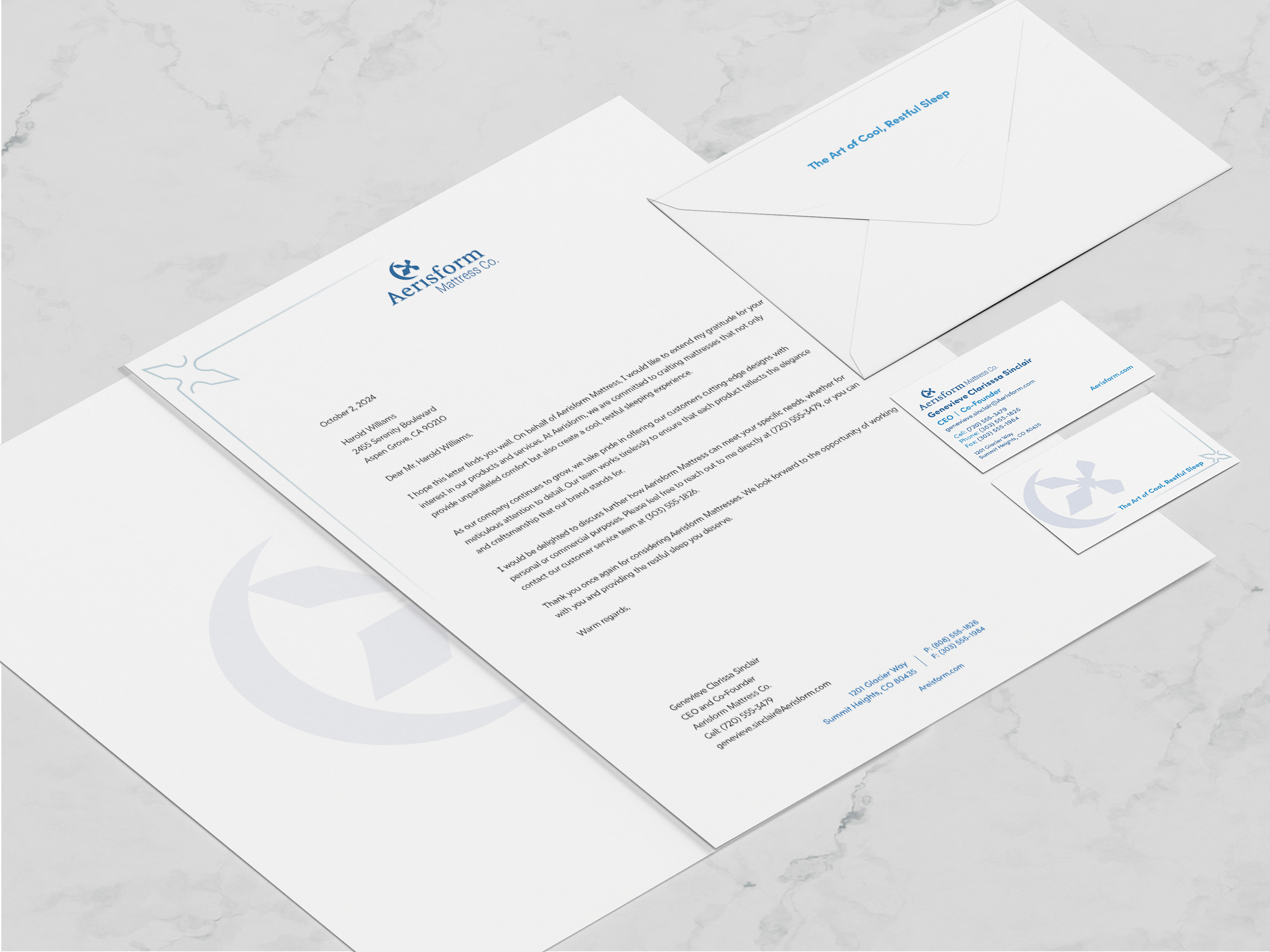
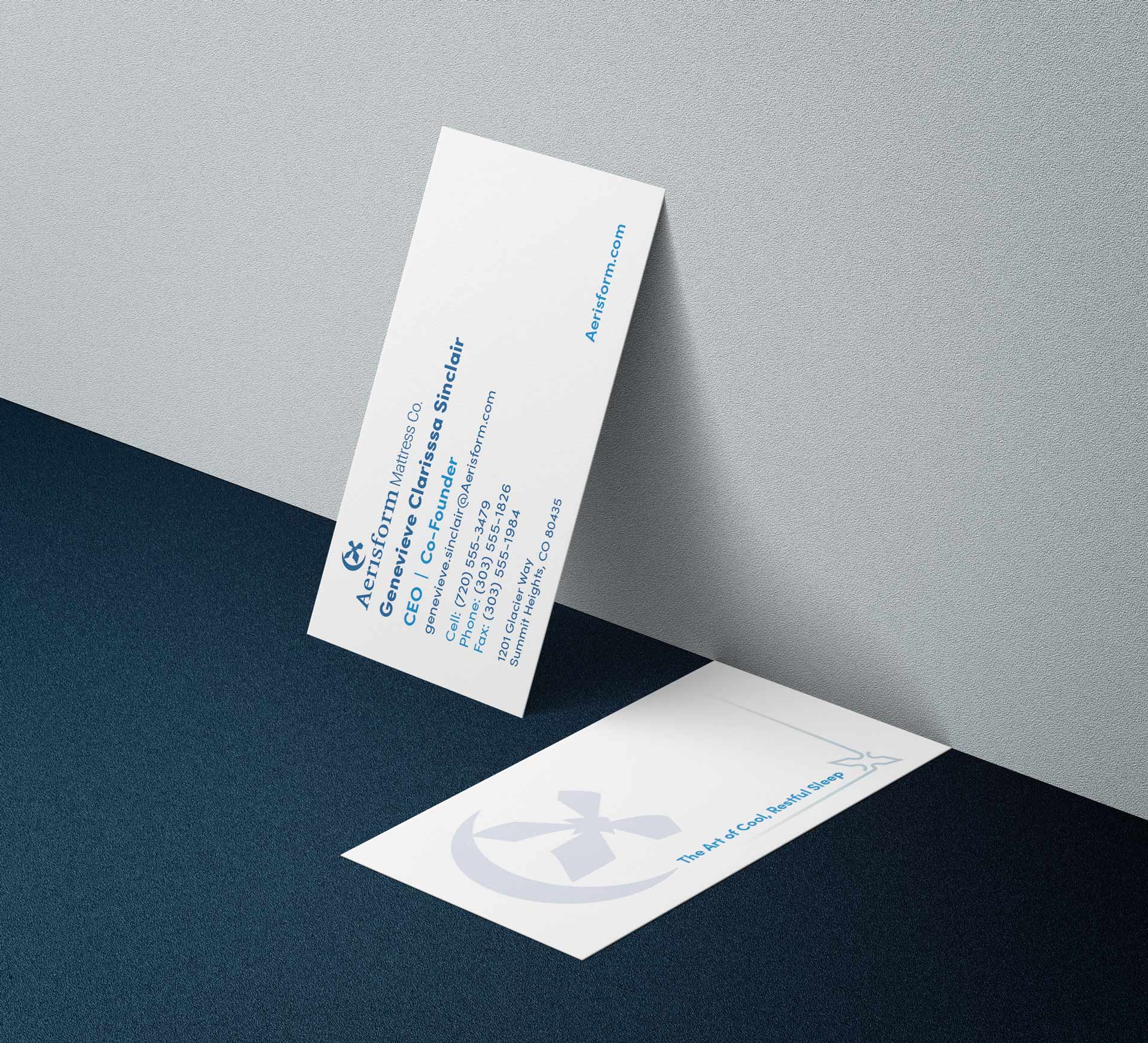
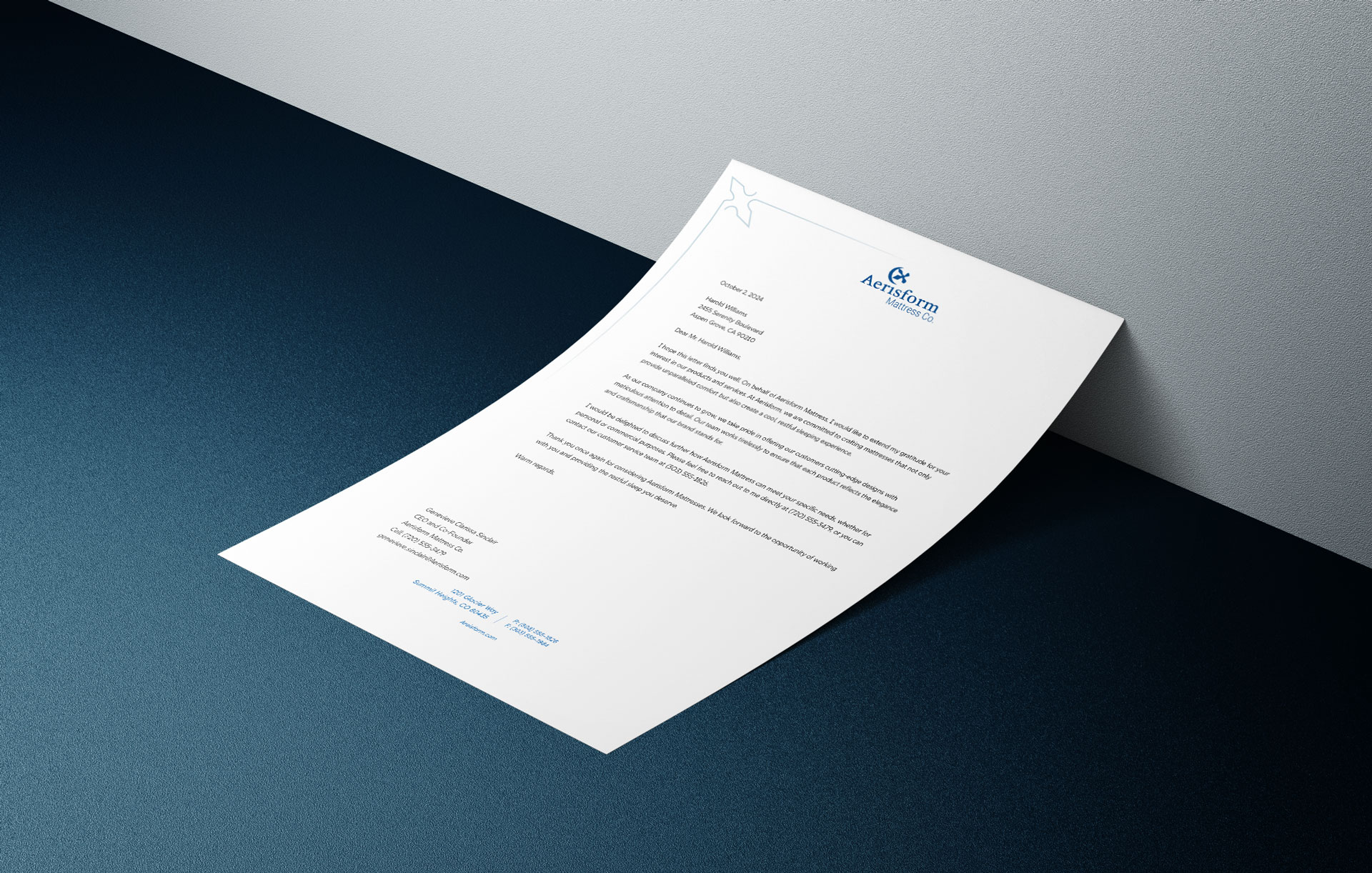
For Aerisform’s stationery set I designed a letterhead, #10 business envelope, and business card. I kept things simple, but still manage to keep that icey visual throughout the brand. I actually struggled with adding “too much” decorative elements that distracted from the necessities. Aerisform is a brand that focuses on getting the job done. The idea was that most money would be spent on research for their products. So, they wouldn’t want to spend extra on printing.
