Typographic Poster
Introduction
This project required research of a typographer or designer and creating a poster centered around their style, works, and ideas. In addition, the project limits using only type to create an abstract composition or pattern.
Objectives
- Sketch ideas using only letters.
- You can use numbers and punctuation.
- You can use caps, lowercase, bold, italics, and you can combine them.
- Select one typeface from the list given to you to create a composition.
- Identify a designer and/or a typeface to research.
- Utilize a grid to organize content and images.
- Establish hierarchy in a poster format.
About the Typographer
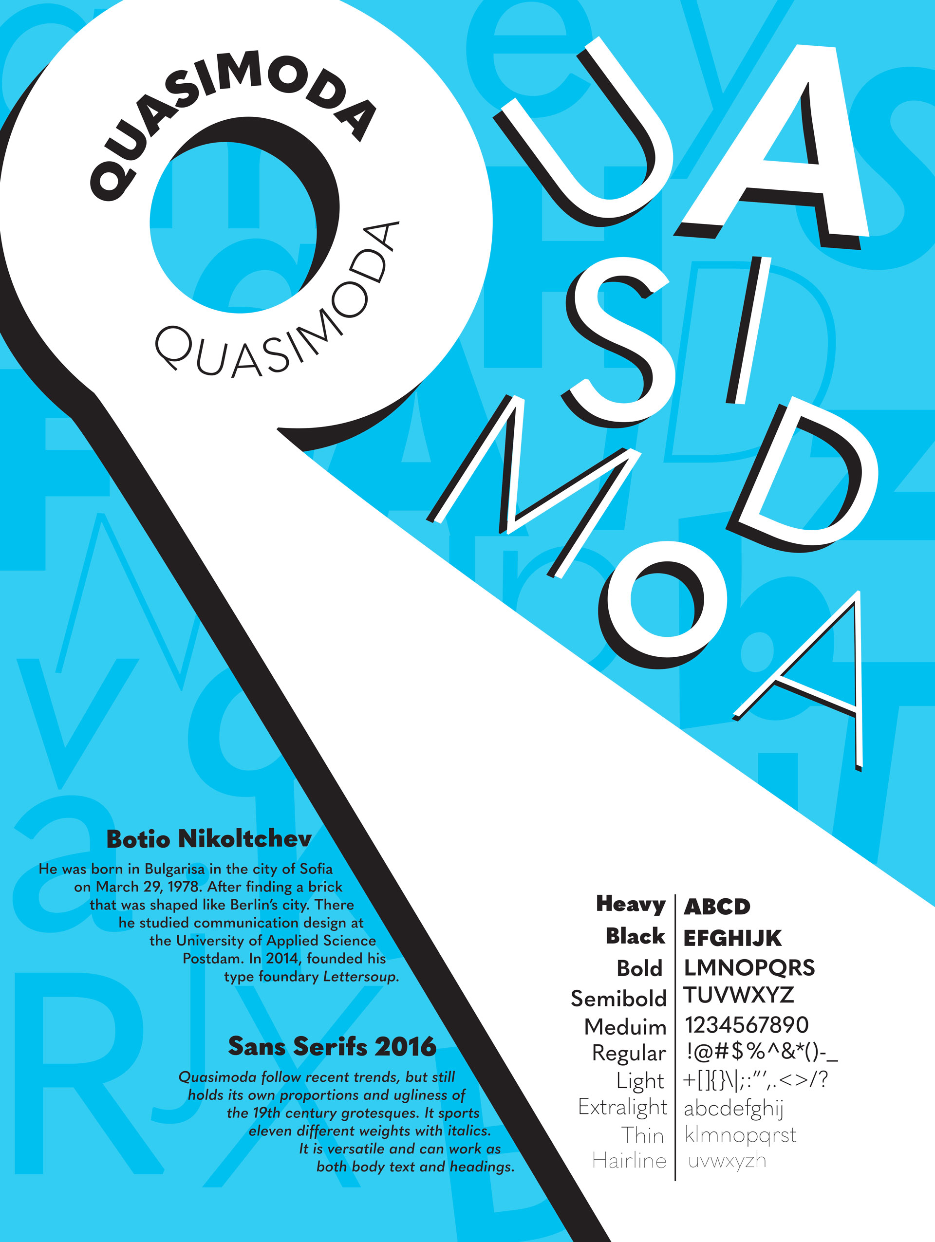
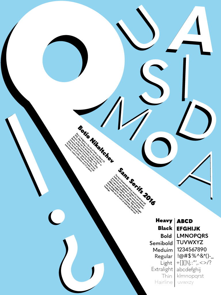
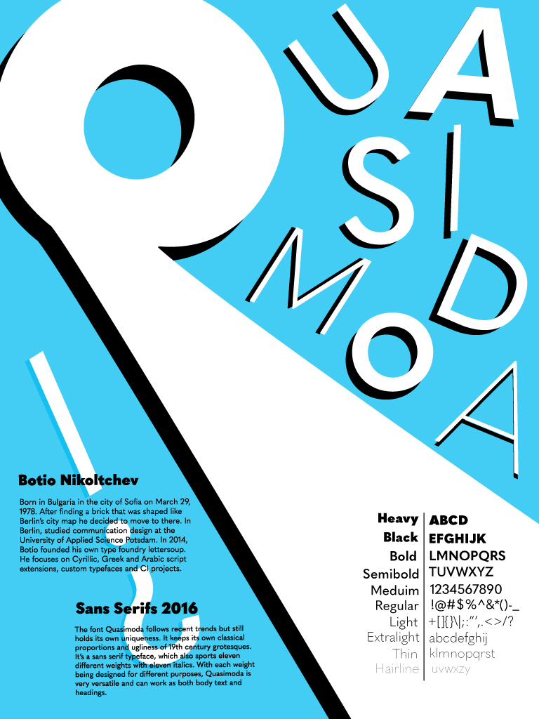
Botio Nikoltchev designed the typeface Quasimoda. He was born in Bulgaria in the city of Sofia on March 29, 1978. He decided to move to Berlin aGer finding a brick that was shaped like Berlin’s city map. There he studied communication design at the University of Applied Science Potsdam where he took classes with Luc(as) de Groot, a Dutch type designer.
Starting in year 2010, aGer university he also had opportuni#es to work with other type designers like Ole Sch.fer, Ralph du Carrois, Łukasz Dziedzic, Akira Kobayashi and Erik Spiekermann. In addition, he also helped create the Cyrillic characters of PTL Manual, PTL Manual Mono and PTL Notes with Ole Schäfer, who specializes in corporate design. In 2014, Botio founded his own type foundry lettersoup. He focuses on Cyrillic, Greek and Arabic script extensions, custom typefaces and CI projects.
About Quasimoda
The font Quasimoda follows recent trends but still holds its own uniqueness. It keeps its own classical proportions and ugliness of 19th century grotesques. It’s a sans serif typeface, which also sports eleven different weights with eleven italics. With each weight being designed for different purposes, Quasimoda is very versatile and can work as both body text and headings.
Process

Artist Reflection
“This project was difficult in the beginning as the objective was confusing. At first, I thought it was an informational poster about either a designer or typeface. However, it was more about creating an abstract piece using only type. I found it hard to not sketch with color so most of the sketches are with color. I used mainly pens, markers, and highlighters. The highlighters were my favorite, and it really gave me ideas with neon as the main vibe. Honestly, fifty sketches felt like a lot, they always do. However, as I kept going and looking at my visual research, I found the ideas coming to me better. Compared to my other projects, this one had the most process and stages. I really enjoyed the outcome compared to the other projects and feel especially proud this time.”