I came up with my own magazine title, and concept. Once that was decided, I began developing a look for the nameplate that will appear on the front cover. Although watches weren’t something I was interested in, I thought designing a minimalist look would help my portfolio. This project assigned designing a cover (9.25” x 11.75”), table of contents, and a two-page spread. In addition, the spread should be more than just text.
Cover
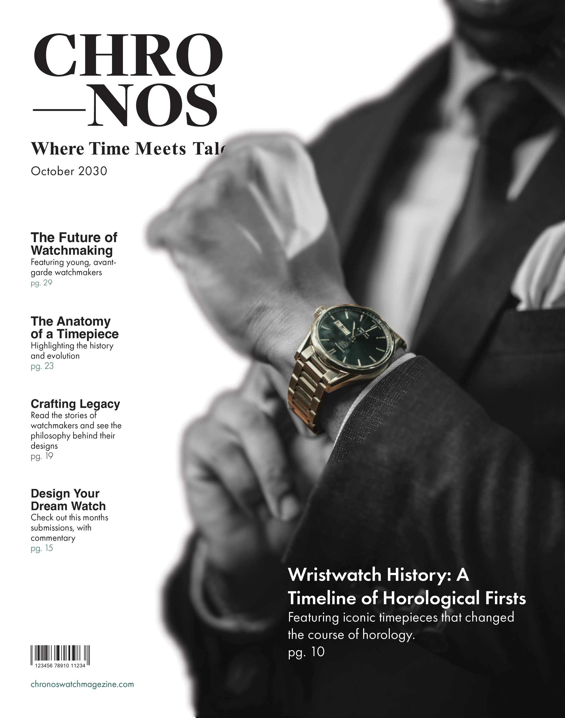
For the cover, and overall theme of the magazine, I went for grayscale and color picked the jade green of the watch as an accent color. For the type, I chose Helvetica and Futura Pt. Common minimalistic fonts. I made up the features and their descriptions, except for the main feature.
Contents
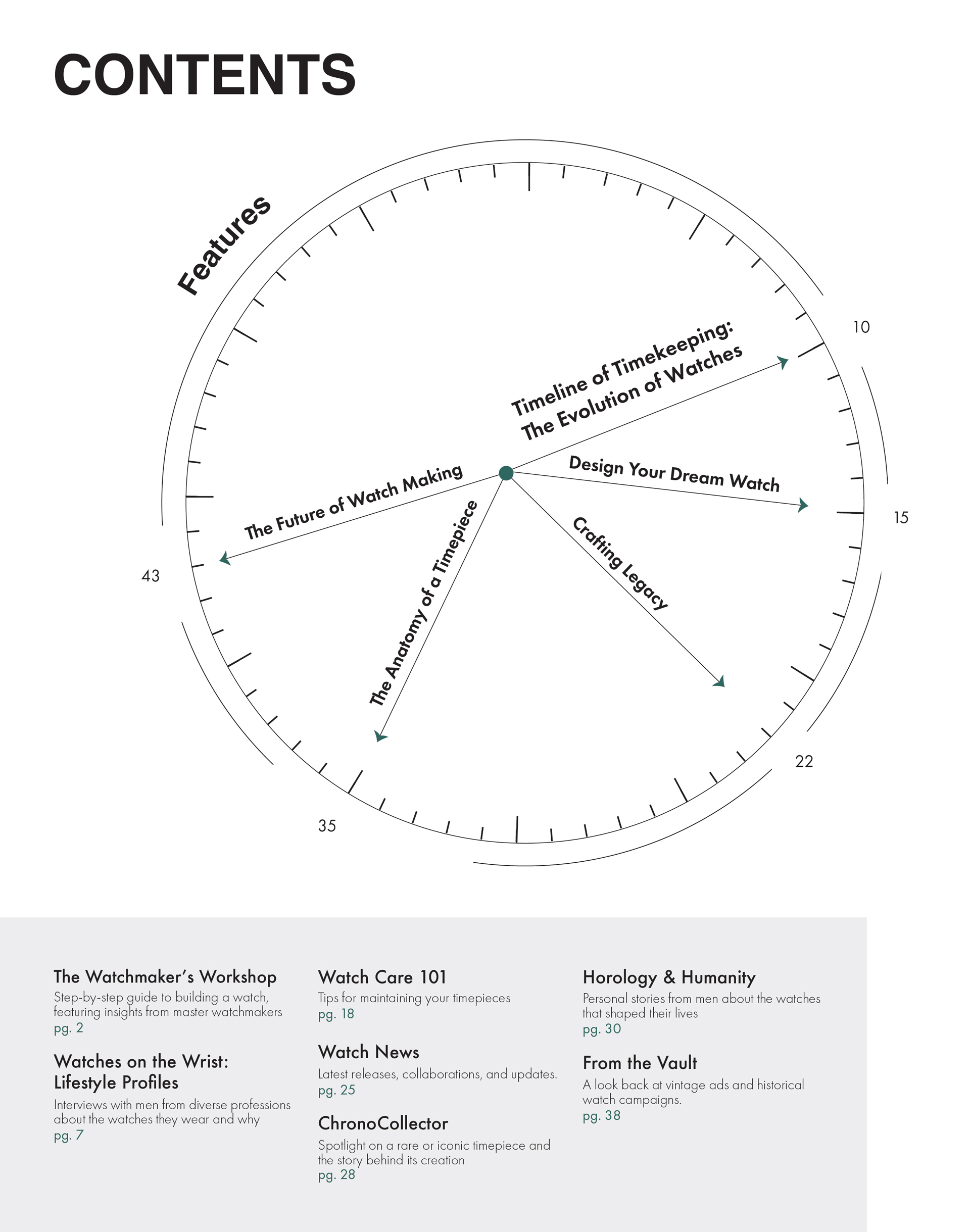
I had the most fun with this page, especially with the clock motif showcasing the featured stories. I had a hard time placing the “Features” heading, but I think it works where it’s at right now. For the other contents, I had to adjust the leading, and font size to get rid of widows and have all the chapters fit in one column.
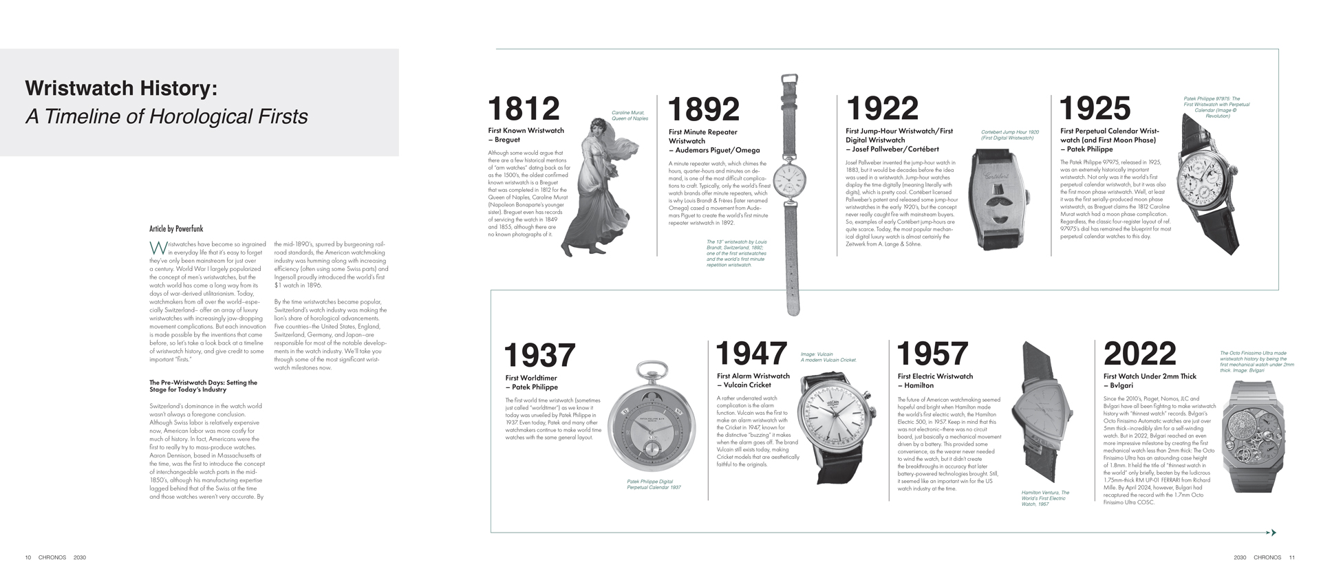
Spread
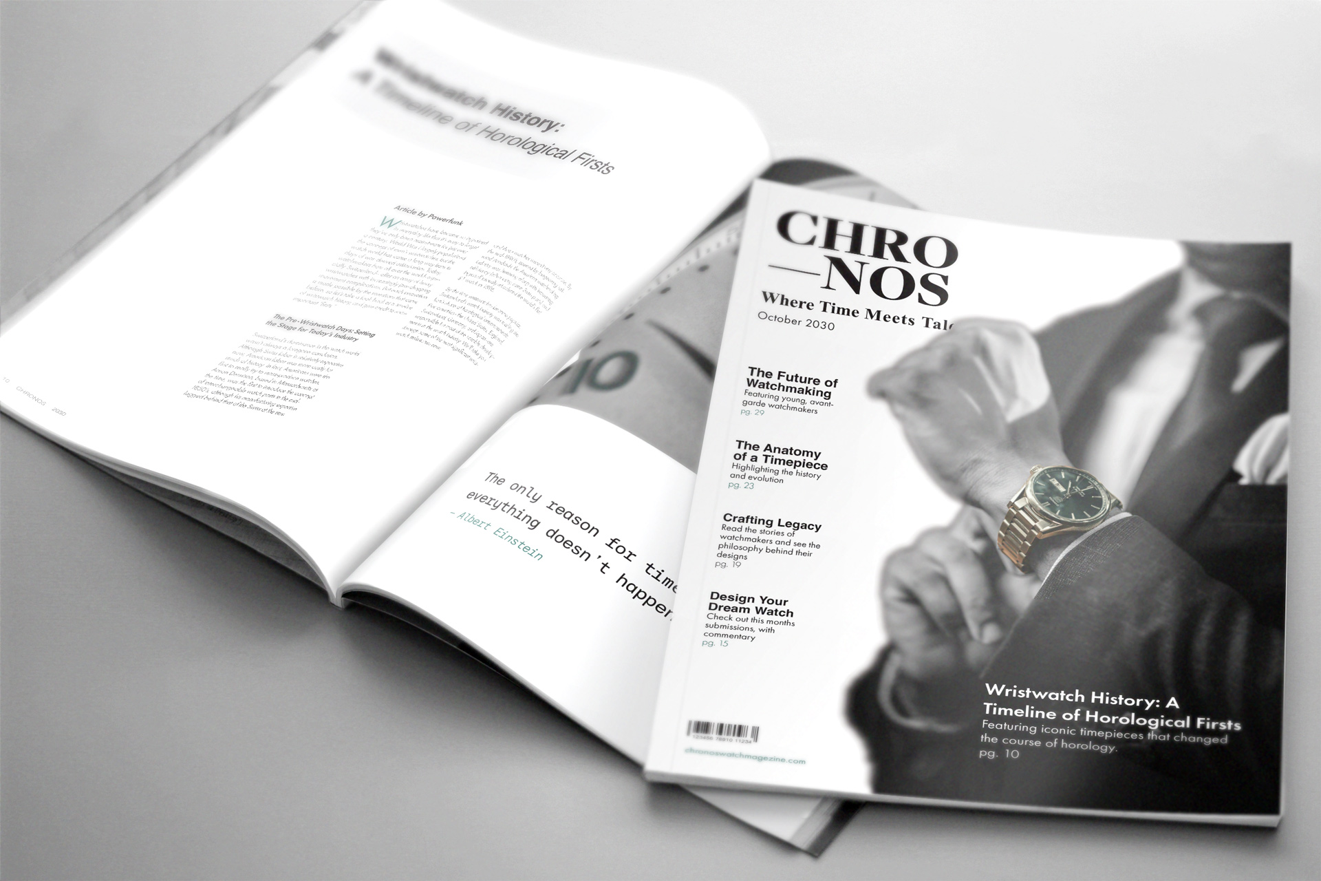
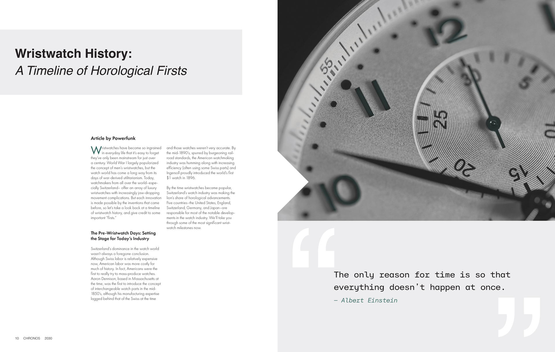
One requirement for the two-page spread was that I had to think beyond just pages of text. Maybe have images, illustrations, etc. Something to stand out. So, I thought doing a timeline would be interesting. However, I couldn’t fit everything I need onto only two-pages. So I decided to design a spread that flips out into another page. The first image is how the spread looks closed, and the second is how it’s open. I had some ideas for the closed page, but decided on a quote. One idea was to have the dates of the timeline, but it felt redundant. I got the article from GreyMarket by LUXURY BAZAAR and was written by Powerfunk.
Here is the link to the article if you are interested in reading it yourself!